YCombinator Application
Rowan Cockett, Steve Purves · January 15, 2021
The following is an excerpt from our application to YCombinator, which is the premier startup accelerator in Silicon Valley. We were selected as one of 8 Canadian companies with over 16,000 global applications. From January to March 2021, we went through their Winter 21 accelerator program.
Read the press release on Curvenote’s acceptance into Y Combinator.
What does Curvenote do?
Describe what your company does in 50 characters or less.
Platform to build, remix, share & explore science.
What is your company going to make?
Please describe your product and what it does or will do.
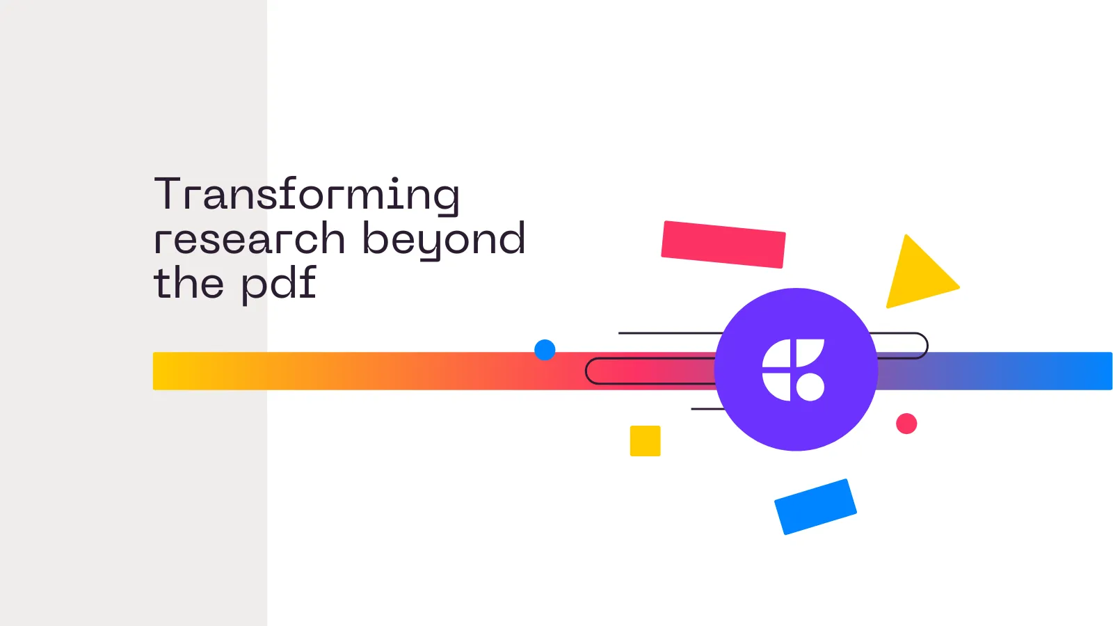
We are creating an online platform for writing, sharing and re-using scientific content. Curvenote is connecting the building blocks that make up documents and presentations to their computational origins, so that they can remain linked and interactive -- enabling interrogation, adaptation, organization and extension of ideas.
Our approach is to create small, meaningful “blocks” of content (e.g. figures, equations, paragraphs, code) that track versioning, licensing and attribution. These blocks can be composed into traditional, linear documents or pulled apart and rearranged. We enable collaboration across a spectrum of computational abilities, through integrations with Jupyter Notebooks to track experimental progress and “import” interactive outputs into reports, documents, and presentations.
Impressive thing you have built or achieved?
Please tell us in one or two sentences about the most impressive thing other than this startup that you have built or achieved.
During my undergrad in geology I saw my peers struggling with 3D visualization of geologic models, I was teaching myself how to code and started creating visualizations for them. After I graduated I turned that into an app, which has now reached over a million students, I then bootstrapped that into a business for 3D geoscience visualization in education and oil & gas training, I created a five person team and after two years sold the company to a leading geoscience modelling company (without dropping out of my PhD along the way!).
How far along are you?
By mid-October 2020 we will have an alpha of our writing/publishing platform and an integration that adds commenting and version control to Jupyter (an interactive computational environment). This allows data-scientists to remix their notebooks with other content created on curvenote.com and creates access to a lot of existing content in Jupyter Notebooks. We have been testing the value proposition with early users and we will present this integration at JupyterCon on October 12th.
Why did you pick this idea to work on?
Do you have domain expertise in this area? How do you know people need what you’re making?
I want to help accelerate the speed, relevance and accessibility of scientific discovery.
The way that science is shared has not been substantially updated in 250 years. That is, science remains a collection of letters with citations that must conform to the metaphor of paper (no links, overlays, interaction, and not easily machine readable). Furthermore, the medium of sharing is disconnected from how scientists work on their ideas -- a majority of researchers write using Microsoft Word, collaborating by email; even basic version control and real- time collaboration is not in place. The headaches multiply when working in distributed teams and on large-scale computational models and data, both of which are integral to modern science. Static figures are copy/pasted between your computational environment and your PowerPoint slides. This disconnect between working, sharing, and communicating ideas prevents efficient feedback loops, delays publication (sharing), and stunts the evolution of ideas.
Platforms and tools that tightly connect discovery and communication will increase opportunities for external feedback, promote collaborative evolution of ideas and ultimately increase the relevance and pace of scientific breakthroughs.
My previous startup (3point Science, acquired March 2016) provided 3D visualization tools for geoscience -- in working with many technical consulting firms, I observed their time and expertise being wasted writing repetitive reports, keeping content updated and in sync, and providing a compelling user experience for their customers (e.g. embedded 3D graphics, getting feedback, etc.). The biggest problems were integrating traditional reports to interactive, computational visualizations in a flexible way as well as providing ways to reuse and edit template-like content.
In my own experience creating, writing and collaborating on technical papers, presentations and my PhD thesis -- I know how hard it is to keep things up to date, organize my thoughts, integrate my computational results, and also get feedback from my collaborators in a meaningful way.
What’s new about what you’re making?
What substitutes do people resort to because it doesn’t exist yet (or they don’t know about it)?
There are two things that we think are new about the company we are building: (1) our decision to treat the two communities of data-science and scientific-publishing as a single market while encouraging collaborative feedback loops between these domains; and (2) the way that we think about content, which allows people to reuse it, connect it, and improve it over time. We believe this can create a new way of sharing and working on technical research and experimentation. Currently it is not possible to “import” a figure, widget, equation, or paragraph. Because of that, you cannot improve or build upon other peoples work, this new way of working & sharing allows for remixing, which we think will have implications across many technical domains. For example, from how an executive or product manager consumes and interacts with a data-science report/outcome; to how a student interacts with research and education; to how scientists publish and get feedback on their results.
Currently, collaboration happens through static, disconnected screenshots of computational data over email or in PDFs, PowerPoint, Word, and GoogleDocs. Data-science/business-intelligence dashboards or other custom solutions are other end-members of communication. However, these dashboards often fail to give the relevant context to those who are consuming them, and (somewhat ironically) other reports/presentations statically include screenshots of these interactive dashboards.
By making it possible to import and remix other peoples work (or your own), there are many new opportunities from the knowledge-graph that is created through the links between “blocks” and the organization of content. This is ultimately the new “thing” we are making, which is currently not possible to make because of the way researchers work and share. Even with the first features of our alpha product, including block versioning and portability via OXA Links, we’ve surprised ourselves (as we are also users of these workflows) by how transformative these changes feel when working and sharing.
Who are your competitors?
Who might become competitors? Who do you fear most?
Our biggest competitor is probably email coupled with the many other ways you can transfer static technical content (Word, PDF, PPT, etc.). This isn’t so much of a problem for early adopters who are aware of the problems this creates, but is likely a significant challenge in crossing the chasm.
There are competitors that are outside our core domain that could expand into it over time. For example, ObservableHQ is close to the intersection of sharing and working on data-science and have excellent technical execution. We see Curvenote as focusing on the Jupyter ecosystem rather than Javascript and with more focus on text-based editors and content (rather than requiring markdown in Javascript). We also see Roam Research and Notion as excellent note-taking/collaboration tools that could become competitors; our focus is on technical content and would be reflected by our integrations and plugins, we will also focus more on sharing/publishing than either Notion or Roam Research currently do.
Something Surprising?
Please tell us something surprising or amusing that one of you has discovered.
I competed in science fairs when I was in grade school, I spent a good amount of time gluing my science onto cardboard and colored paper. I went to my first “real” conference in undergrad — AGU in San Francisco, a large geophysics conference with 27,000 participants annually — there were over 15,000 poster presentations in 5 days. I thought it would be wildly different with professional scientists, but other than the fact that they were printed rather than glued, there was really very little difference (some were even glued!). These are the experts; communicating about climate change, groundwater scarcity, and changing weather patterns — and the medium for communication and collaboration — is just — it could be so much better.
Introduce the Founders
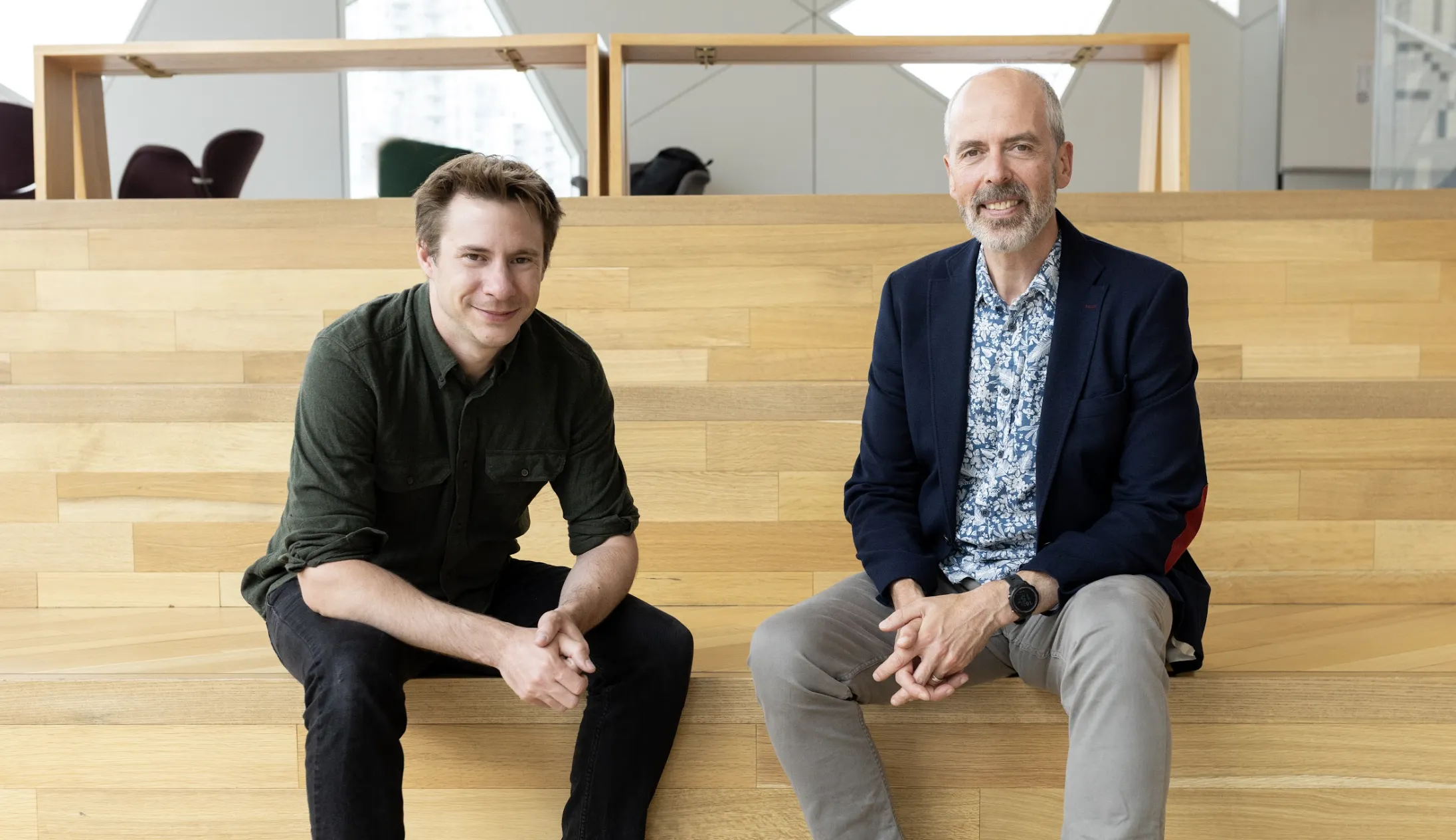
At the time that we applied, Steve Purves was working part-time as a contractor for Iooxa (now Curvenote), when we were accepted into YCombinator in 2021, Steve became one of our founders!